
 Quote
Quote[IMG]Insert Link here[/IMG]Originally Posted by EatYerGreens


2023 Bohs shirt out now too.
Has 'the Auld Triangle' printed througout the stripes.
Not entirely sure what I think about how that looks to be honest.
Adult 2023 O'Neills Home Jersey {Regular Fit} – shop.bohemianfc.com (shop-bohemianfc.com)
(If someone can explain how to imbed an image in a post, I'll put the Bohs shirt up that way to save everyone clicking-through. GRMA).

[IMG]Insert Link here[/IMG]
Not keen on that personally. Can't put my finger on a main reason, but it just doesn't seem to work for lots of little reasons. I think the crest could really do with being the normal one with white on it, to help it stand out. And the sash should at least go to the top of the shoulder, rather than stop below the collarbone.
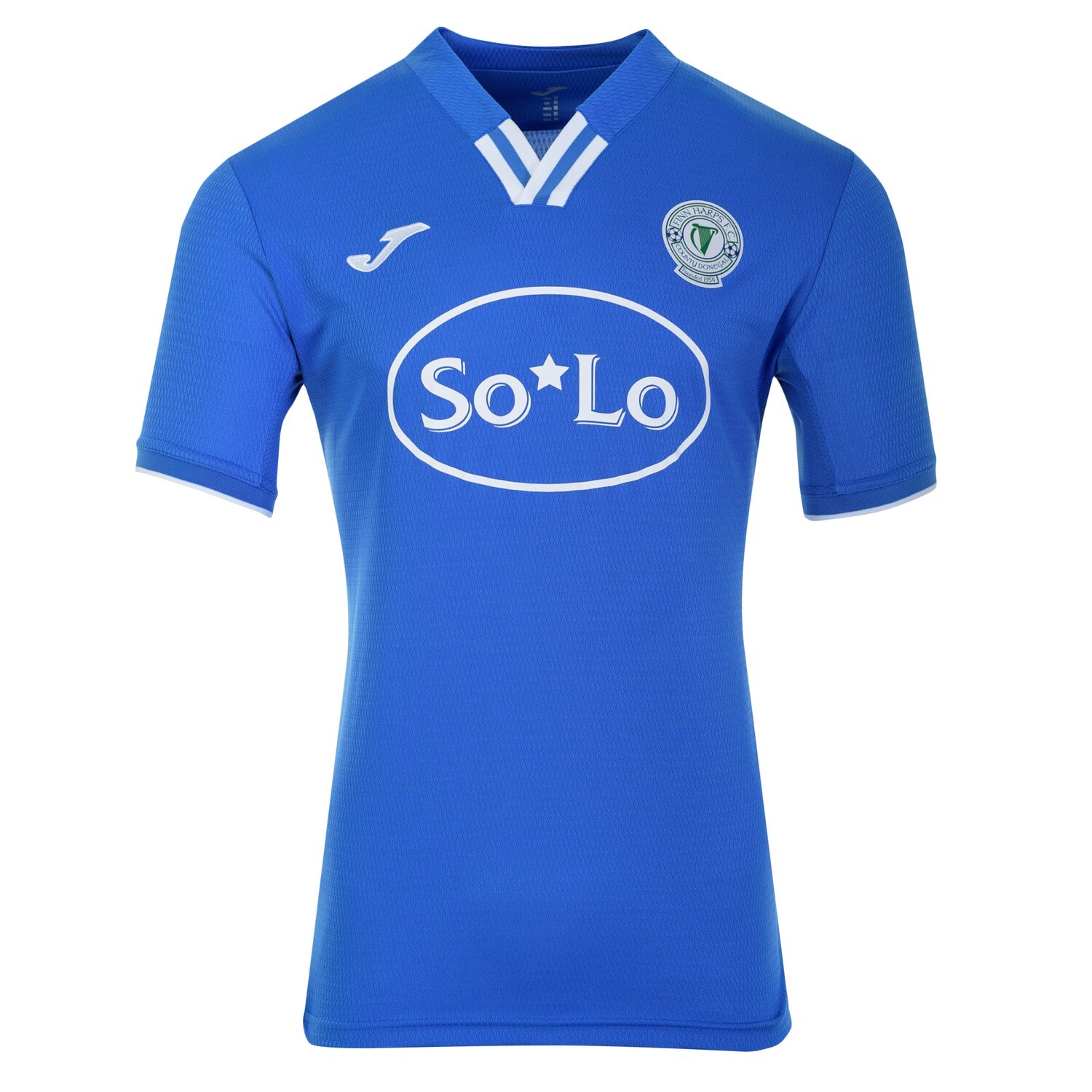
Sashes are also a bit old hat in football shirts at the moment anyway. Harps beat to them to it by a few years, for example.
Its a modern copy of a GAA shirt. I wore those colours for Parnells GAA club in Dublin a long time ago.
Think we have the edge on Cork in the home green shirt "Munster final" :


Thats a lovely Cork City jersey!
Gary Cronin is he the right man to manage Longford Town?
The white blocks on the shoulders are too big for my liking, and detract form it. Also make the red stripes stand out a lot too. I've preferred Cork jerseys when they've been almost entirely green tbh.


The new Waterford jersey in case anyone hasn't seen it yet.
https://pbs.twimg.com/media/Fnfsu2pW...jpg&name=large
God that's awful !
I like that home kit. The blue trim on the sleeves and neck looks well, and I like the style of the stripes
Finn Harps 2023 Home kit . See here https://fhfcshop.ie/Finn-Harps-2023-...ult-p529971308
54 Crew-Finn Harps FC Supporters Club
Following Harps Home & Away
https://www.facebook.com/54CrewFHFC

Harps home 2023
https://kesslereffect.bandcamp.com/album/kepler - New music. It's not that bad.
You just know that having So*Lo on your shirts is going to spawn lots of jokes/jibes.
We've come a long way from having Borderloo Toilet Hire on the back of the jersey a number of years ago.
I couldn't care less what's on the jersey if they pay their way to be on there, to be honest. There's worse sponsors and worse logos in the league on jerseys currently.
https://kesslereffect.bandcamp.com/album/kepler - New music. It's not that bad.
Ridiculous numbering on the shamrock shirts , just trying to watch a pretty poor stream of the cup game in Derry there, bloody invisible that rovers numbering, might as well not bother.
Our shirts at bohs last season were similarly bad, black numbers on a red background, stupid stuff. You’d imagine shirt design would be a wee bit more attentive than that.

I was at rovers game against UCD on Saturday and the numbering on the away kit is fantastic, really easy to see.
Could have done without the pinstripes, IMO, but that's a minor complaint!
Agree. I think they detract from what would otherwise be a decent shirt.
 Posting Permissions
Bookmarks