


Treaty announce they'll have an O'Neills kit next season.


Very plain but quite nice. Probably best for a new and unproven supplier to go with something simple for their first effort. It’s better than any of the Cx Sport Dundalk kits in my opinion, a lot of which tried to do way too much with the design
Paaatrick's Agletic


Some more photos here, have to say although very plain, I do like it.
https://www.dundalkfc.com/new-home-kit-unveiled/
#DundalkFC - First Irish club to win an away game in Europe (1963), first Irish club to win points in a group stage in Europe (2016).
The connection with the GAA colours makes sense, and the link to the county's history seems a nice touch.
That new Wexford crest is horrendous. It looks like a transition year student made it on Microsoft paint. The addition of the vibrators to it doesn’t help things at all
Paaatrick's Agletic
Yeah it's simple but it's not cheap looking. Should sell well.Originally Posted by oriel

Upwards to the vanguard where the pressure is too high.
Good to see Wexford moving away from the 'Mick Wallace likes things Aye-talian' phase they've been in, and attempt to adopt a more local identitiy instead.
The new colours probably make sense, but as others hasve said the crest doesn't look great. It's really not obvious that there are supposed to be 3 pikes on there either, or that they allegedly combine to symbolise a 'W'.
The pike could become a good symbol of the club though. If I was them I would have just gone with a single one on the crest.
People of a certain age may remmeber Wexford band 'Cactus World News'. They used to sell badges in the shape of the top of a pike, which looked good and could be a merchandise piece for Wexford FC. Though you just know that the cloub and its fans will now become known as 'The Pikies'
Pretty sure Bohs had hoops one season, maybe 83 or 84, have vague memories of Paul Doolin / Rocky O'Brien in something similar.
Its not bad, zig zag effect is cool, but I'd have gone for black with very thin red hoops, too many PD home teams have red or red base, can only use this v Cork City, Rovers and UCD. Mind you probably Pats away as the ref will deem too much white on Pats again and both teams will have to change, like last year.
#DundalkFC - First Irish club to win an away game in Europe (1963), first Irish club to win points in a group stage in Europe (2016).
Looks a bit rugby-ish to me for some reason
Paaatrick's Agletic

Thought the same as well...think it's the collar

The Sligo kit is all over the place, Joma designs are absolutely shocking. Really like the Dundalk one, plain but classy. Their away one is snazzy.... The font for the number and name on the back is the same as the new LOI logo. is that something the LOI are bringing in for all shirts?
'Fascists dress in black and go round telling people what to do, where as priests.....'

Jaysus - there's a blast from the past.
It's been a while Pauro!

Welcome back Pauro you must have only remembered your password!
Gary Cronin is he the right man to manage Longford Town?
The massive sponsor's logo would seem to make Cobh's home offering a hard sell:
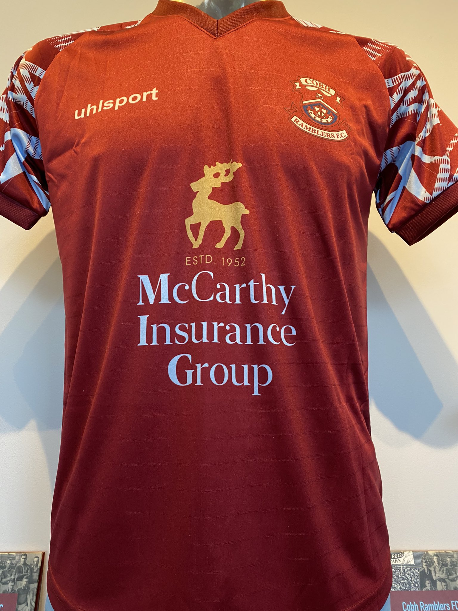
The design is lovely...sponsor ruins it
Agree. It's the text bit of the sponsors logo. Take it down a couple of font sizes and it would all be fne. But it just dominates the top too much at the moment.
 Posting Permissions

 Quote
Quote
Bookmarks