

As a newish poster here who featured in two of them quoted posts I'm fairly disappointed with how things turned out really the jersey. I still feel it was a brave angle for any club to go down and expect when you are told all bases are covered , that they are covered. That wasn't the case here and humble pie tastes as bad as it sounds so we take the stick and move on.
The board behind this have worked wonders to finish mid table and turn a profit two seasons in a row.
I told you so and hindsight all well and good but to compare these lads to the boards of previous times is ridiculous. Rovers are totally different from the crowd that spent s million on grant money on players . Cork different to the Arkaga time and Shels different to the Ollie Byrne mess .
Hopefully a lesson has been learned and I'm sure some info re the situation will come out of the meeting taking place tonight. ( That was always planned for tonight)


Dan is fairly clued up to be fair so I'd be very surprised if it was the case that ye just paid 50 quid to licence an image off Shutterstock or something like that, was it done through a legit licencing agency or a stock imagery site is the thing though as if it legit was a licencing agency they made a haimes of it. It should have been made clear by wherever the image was sourced from that even though you have the licence for the image itself, that's only for certain circumstances such as web/ print advertising use and may or may not be modified in of itself depending on the T's and C's. Plus then you'd still need to clear the usage of any related part of the image which is where the Marley Foundation kick in and as was mentioned they're notoriously litigious and have tried to corner the entire Rasta scene imagery wise, never mind just Bob.
A pity it got the kibosh (in true #greatestleagueintheworld fashion!) but fantastic marketing and PR off the back of it. Not too sure about replacing it with the Ultra's fist though with it's connotations and already being used by Rovers etc. Would have been a better shout with Mob Barley not being a goer anymore to keep it on brand with the Soviet visuals which would tie into the previous campaigns and the lefty leanings, maybe that could be the next away one, a big giant Lenin or Trotsky head on the next away jersey!
Umbro announced they'd be making Shels' kit next year.


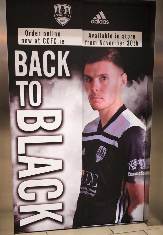
Cork away 2019

Interesting choice of colours. If it was all black but black and white? They do say imitation is the sincerest form of flattery!
Last edited by Nesta99; 22/11/2018 at 7:35 PM.
Lolz, if you can't beat 'em, join 'em!


Jeez what are the boys in Cork thinking?
I'm trying to imagine the reaction in rovers if we announced we were playing in red and black stripes next season.


That was jade NOT green. Interesting story around that, we were offered a serious sponsorship deal with a certain well known gambling company but only on the provision we changed our strip to green.Even though the club was in dire financial difficulties this was considered a step too far and the offer declined.The compromise was the 'jade' shirt we had (with no white) and the players were all given green boots (some wore them some didn't). Fair to say the 'jade' number did not quite generate the demand of the current away shirt

Hi @LegiaWarsawEN, nice to meet you. We're @CorkCityFC - the (former) Double Champions of Ireland. We play at Turner's Cross.
We just signed a player from the Premiership, our players score goals from 100+ yards, and though we didn't win the league nor cup this season, we'll now occasionally wear the colours of the team that did.


I'm not a fan of it. An all black would have worked better.
This is actually our 3rd black strip ever so while it's unusual, it's not really new. The first 2 were a throwback to Cork Celtic as far as I'm aware.
Do Dundalk own the colours black and white in every combination? Its not like its a unique colour combo. It doesn't look remotely like a Dundalk jersey to me.


It does a wee bit, but looks more like a Sligo GAA top.
I think it's not great, looks like a training top.
It needs more colour. Derry have had black away tops before, but at least with some red trim and the like. They worked.
It's strange that the Cork and Clonakilty logos are in black and white, but the UCC logo isn't.
Bookmarks