
Here you go:
Whoopsie, I think that might be the old one...


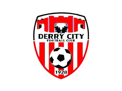
Can't get the Search function on here to work at all - so can anyone post up the large images of the proposed new crest for the new Derry City?
Kom Igen, FCK...


Here you go:
Whoopsie, I think that might be the old one...
Last edited by Mr A; 11/02/2010 at 11:29 AM.
#NeverStopNotGivingUp
Nice one!Originally Posted by Mr A


believe its a mushroom with "keep in the dark and fed lots of **** " written underneath, oh and a red hand in the middle
I wish i did not know then what I dont know now

Anything has got to be an improvement on the last crest. I've seen better attempts at local Junior football level.
It's this:
TBH I'm not mad keen on it. Crest by committee. The Derry City Football Club text just doesn't look right

Why do Derry have a new crest?
Life without Rovers, it makes no sense...it's a heartache...nothing but a fools game. S.R.F.C.
This is the original idea - from which that one was *******ized. Much more elegant IMHO.
http://img193.imageshack.us/img193/629/crestpng.png

i prefer Mr. A's.

I like high energy football. A little bit rock and roll. Many finishes instead of waiting for the perfect one.

Coz they're a new club isn't it?!
Surely its founded 2009 or 2010 actually. I know the point was raised on here before but surely even Derry fans wouldn't be so arrogant as to dismiss the fact the club actually reformed in the last few months and so cannot claim the club was formed in 1928. Genuine question.

It's a horrible crest anyway... The one it was copied from was much nicer... But yeah... The club was formed in the last couple of months...

Why can we not? The company that ran the club may be in administration but try telling most fans it is a different club.

Well it is.

Well tough ****, the CLUB was founded in 1928 and will always stay that way.
Did we get a new crest in 94? No.

The 1928 is purely a reference to the amount of creditors owed money by the boys of the auld brigade in Derry!
What's your point? The old Derry City changed their crest in the past see your avatar. Lots of clubs change their crests over the years.
We had a similiar situation in 94, our crest still stated "1928". But here, keep on with your ignorance......

Is it not how many contracts they had last season?
 Posting Permissions

Bookmarks